I am a great believer in the power of the written word. In fact, only recently I’ve urged you to write as if your next word will be your last. However, there comes a time when you just need to play. Remind yourself what is it that you love so much? Why do your fingers tingle? Why does your heart beat so hard when you stumble upon a pile of ink pads and paint mists?
Unleash your creative child and experiment with colors. Reveal the artist within you!
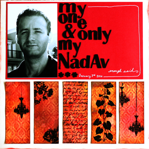
In the layout above I did just that. I experimented and played and had fun. Here is how I did it:
Tools & Supply
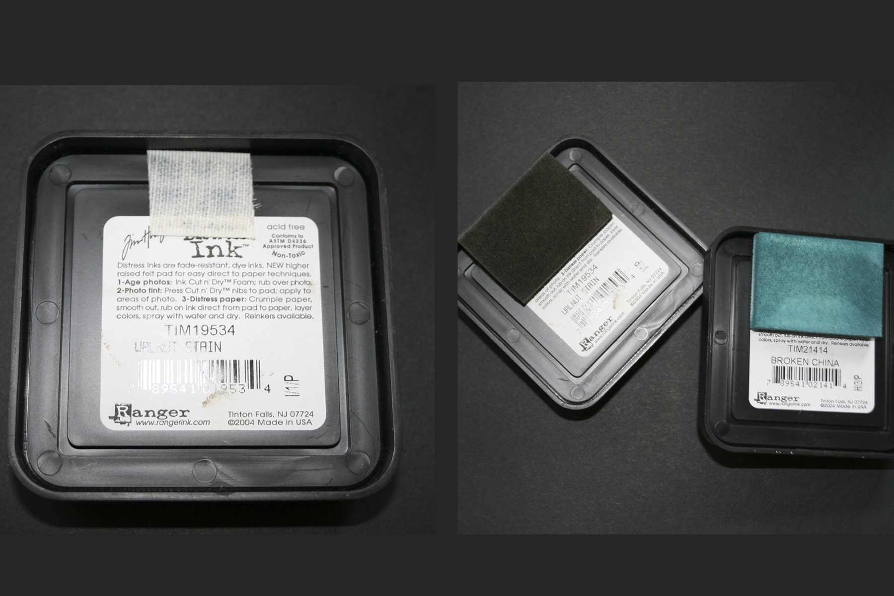
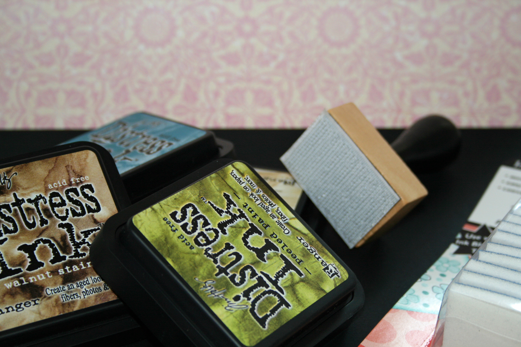
- Distress Ink – Spiced Marmalade, Mustard Seed, Walnut Stain, Fired Brick.
- Stamps – Prima: Chandeliers, Prairie, Petticoat Pattern, Hero Arts: Silhouette Ivy, LA Letter.
- White Uni-ball Impact Pen.
- Heat tool.
- Versamark Ink
- Foam blending tool.
- Embossing powder: clear + black.
- Mini mister + water and Perfect Pearl medium.
- Glimmer Mist.
- Cardstock by Bazzill
- Velvet letter stickers by Making Memories.
- Paper towel.
- Smooth heavy-weight cardstock.
- Craft sheet by Rangers.
Step-By-Step Instructions
- Cut the smooth cardstock to 2″ by 5″ strips.
- Stamp the petticoat pattern all over the strip with Versamark ink and emboss with a clear embossing powder, using the heat tool.
- Squeeze the distress ink pads on a craft sheet and mist with plain water until the ink bubbles up. Then lay your strips – stamped side down – on the wet ink and move it around. Use the heat tool to dry and set the ink.
- Spray the strips with the water-diluted pearl medium and with the glimmer mist and blot down the excess ink with a paper towel.
- Intensify the color by using the distress inks directly on the strips with the foam blending tool. Work in a circular motion, from the outside in. Use darker colors on the edges of the strips. Wipe the strips with a paper towel or a baby wipe to emphasize the embossed pattern.
- Dip your finger in clean water and flip it over the strips. The distress ink will react to the water and spread out. It will create a vintagey worn-wallpaper look. Once you get the affect you want, immediately dry it out with a heat tool to avoid farther spreading of the ink.
- Once the strips are completely dry, stamp over them with the rest of the stamps, using Versamark ink and emboss with a black embossing powder. For the Chandelier’s cord I used a glue pen and poured the embossing powder over it.
- Attach the strips to the bottom of your cardstock, about an inch from the edge, centered and evenly spaced from each other. (I used both a tape runner and some glue dots.)
- Adhere the red mat (11″ by 6½”) above the paper strips.
- Adhere the photo on the left edge of the mat, evenly spaced from all 3 adjacent edges.
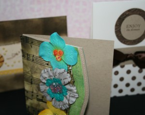
- Assemble your long title with the letter stickers.
- Hand draw an outline around the mat with a white gel pen and don’t forget to write down the date.
- Use the foam blending tool to ink up the edges of your background cardstock with the Fired Brick distress ink by Rangers.
How was your play time?
Share
If you have any question, suggestion or remark – don’t hesitate to contact me – either leave a comment here, use the contact form or start a new thread on the Creativity Prompt Flickr Group!!!
I would also be very happy to see your own creations, so don’t be shy and share 🙂

Check out “Make Your Own Planner” workshop for an affordable monthly and weekly planner in a workshop that keeps on giving…
 The grunge, vintage and distressed look seem to have always been “in style”. this look adds a fabulous touch to a project and makes it look like an handmade, one-of-a-kind piece of art (which is a great look to have, don’t you think).