Thanks for all the wonderful messages, comments and e-mails.
I have been doing really well.
Enjoying my Maya (and also back to work).
I have taken a few crafty classes in the meantime, to keep my sanity, though I haven’t had the chance to actually make anything (Boooo).
Three of the classes have been with Online Card Classes by Jennifer McGuire and Kristina Werner and I loved every one. They really pack a lot of tips, tricks and general card-inspiration into each class. I highly recommend taking one of their classes.
At the moment I am participating in an ongoing class by them, called: His & Hers.
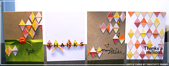
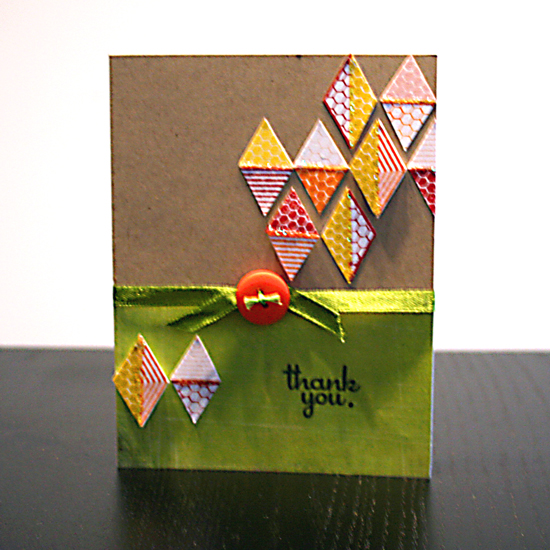
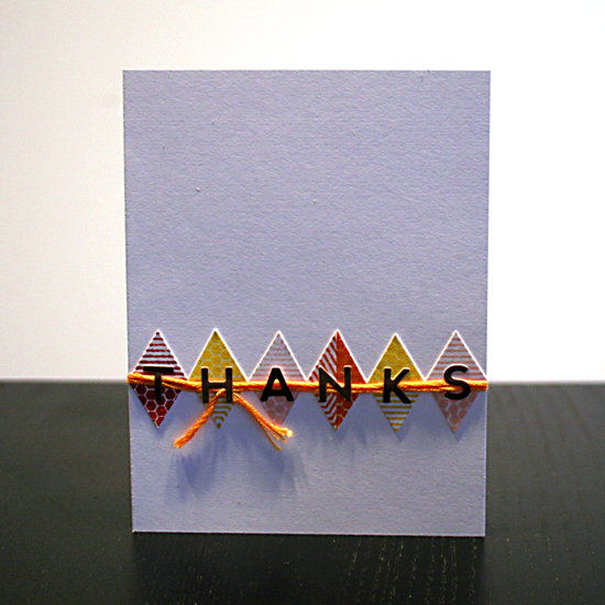
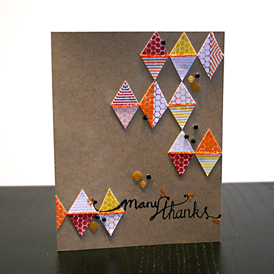
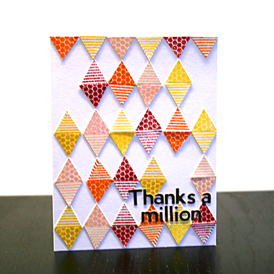
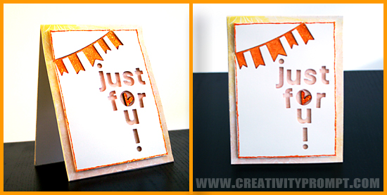
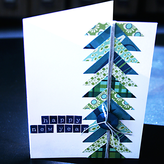
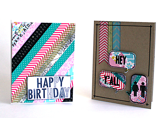
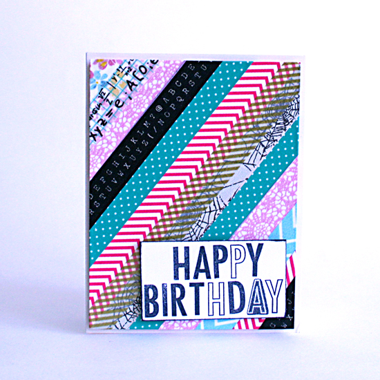
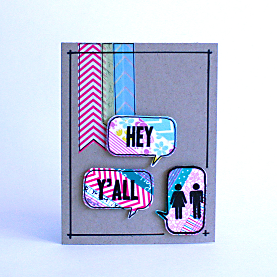
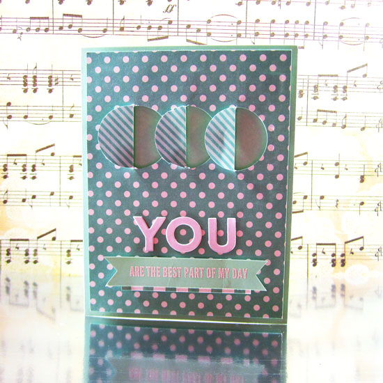
Today Jennifer taught a wonderful technique involving partial die-cutting’ and I knew I HAD to try it out with my own spin, here are my cards:
His:
Hers:

What do you think about the technique that raised me from the online-dead?