 If you like it –
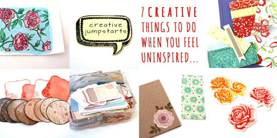
I often find myself wanting to do something creative but feeling a bit uninspired, as if I’ve lost my creative mojo. I know I want to experiment with new products or to try new techniques but I can’t think of a solid idea for a specific project.
On these occasions I try to make mini, one-step projects that are still creative but do not require any pre-planning.
Many times these itsy bitsy pieces spark my creative spirit and bring back my mojo. On other times, I still have something I can use later on, when I have a solid idea but less time…
Here are some of the stuff I do:
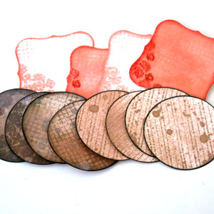
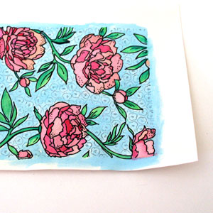 Watercolor stamped backgrounds.
I love the watercolor look that seems to appear everywhere on the creative-web-sphere. The thing is that watercoloring takes time, even for the most basic applications (such as mine). For one thing, post cleanup is required. Plus you have to get water and blotting paper and special watercolor paper…
Do you see my point?
Therefore, I find these inspiration-twilight-zones perfect for a mini watercolor project. Simply stamp a background stamp with a water-resistant ink (such as Stazon) on watercolor paper and color away. Later you can use it as an element on a page or a card. Add some black details with a broad-tip pen for a bolder look.

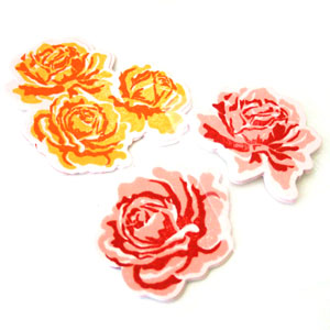
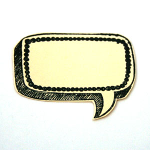 Stamp and cut.
This one is a spin on watercoloring a stamped piece, for times you don’t feel motivated to break out the watercolors, water, brushes, etc.
For that mini micro project you only need one ink pad, some cute, easy-to-cut stamps and any paper.
When I shop for new stamps I always think of images I can stamp, cut and stow for later use… When the time comes to make an actual card, scrapbook layout, mini album or even to wrap up a gift – you would LOVE to have that stash of pre-cut images to use in a snap.
After all, by the time you get really inspired, you want to use your precious time for designing cool stuff, not on technicalities, right!?

 Sew random paper strips.
This creative jumpstart performs a double duty: (1) It’s easy and does not require ANY pre-planning; (b) It’s an AWESOME way to use your scraps and if you are anything like me, you have a ton of them.
I am not very good with the sewing machine (= that’s the understatement of the year). That humble stack of randomly sewn pieces is the combined effort of several mini-sewing-sessions, with months apart… Having said that, I really love the machine-stitched look. I think that it adds a new dimension and texture to any project, not to mention a more finished look.
The great thing about machine stitched elements is that you can’t tell when they were carefully sewn on the project or added later as an afterthought… Which is why I think it’s so great to simply stitch random pieces of paper together. The time will come when those sewn panels and pockets and strips will perform their duty, honorably, on a future project.
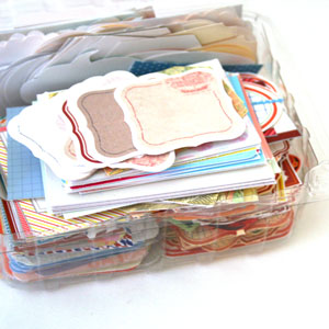
 Make your own journaling spots.
This is another great example of something small that you can do that gives you an opportunity to experiment with different techniques and stamps and can be very useful in the future.
Either punch or die-cut your journaling spots in advance or stamp them first and cut around the stamp image. Then simply play with them => Add distress inks and stains, mist them, stamp on them, doodle, use letter and word stickers on them.
Just have fun and experiment and get as messy or as tidy as you want.
Finally, store them with the rest of your stash for later use.

 Cut pre-made journaling spots.
OR you can simply print one of my MANY free printable journaling spots, cut them and stash them in an old strawberries container, just like I do… [see picture on the left]
You may also use cuter and more tightly closed containers, if you so wish.
I’m not sure I should say so myself…, but they are so useful. I almost always use a piece on every scrapbooking project I make.
Having these ready-to-go pieces is making it much easier to use them. I don’t think I would ever start searching my file folders for a specific journaling labels set, then printing it and cutting it – all just for a specific journaling spot on a specific page of a specific project. I don’t think so.
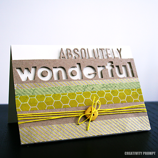
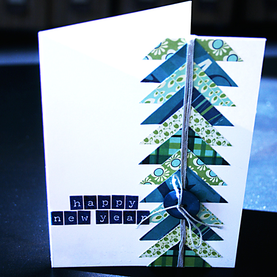
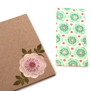 Pre-stamp cards.
I am notorious for buying stamps just because they look cute. I admit it. I used to get them and not be exactly sure what to do with them. Oops.
That was before I decided to simply use them. Duh. I just stamp them on plain card-bases and set it aside until my creative mojo strikes or until I need a quick card and have no time to make it. Whichever comes first. Guess what comes first more often…
Sometimes I just add the cute image to the card base (as you can see on the right) and sometimes I stamp on a 5½” panel that I can add to a card later (as you can see on the left), with or without foam adhesive. Sometimes I also add Stickles, because I’m feeling extra sassy…, but shhh, please don’t tell.
It was very smart of me to use a limited edition stamp set that isn’t available anymore…
 Die cut and stamp.
To finish up, I have another spin on the stamp-and-cut suggestion. Wait for it… it’s a die-cut-and-stamp suggestion. Did I tell you how ‘smart’ I am feeling today? Oh, I just did. Okay.
Many brands offer combinations of stamp sets with matching dies. These are perfect for creating mini professionally-looking embellishments that you can use in so many different ways and on so many different projects. You only need a one-time investment in the dies and stamps set and that’s it. Each additional die-cut embellishment you create is practically free.
Make as many as you need, at any color combination you love at the moment or that suits your stash of paper/cardstock/printed photos…

Share
Do you have other suggestions for creative jumpstarts that need no pre-planning, just some free creative time? If you do, please share in the comments section below!
Back when we were kids creativity came naturally to us. Everything was possible and our prolific imagination was the only limit we knew.
Through the years we have grown apart from our inner creative child and along with that – have lost our pristine and utter joy of creation.
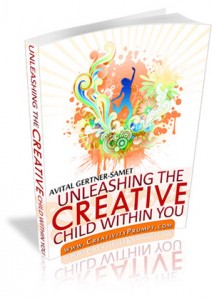
In this e-book I will pave your way back to your inner creative child, brick by brick.
“Unleashing The Creative Child Within You” will explain why you became distant from your core creativity and will reveal the secret to getting it back.
With exercises designed specifically to help you find the inner child within you, regain its confidence and unleash it – you are bound to get your mojo back faster than you think.
Get “Unleashing The Creative Child Within You” for your Kindle
for only $4.99.
You can read the Kindle book on Kindle devices, on your smart phones or on your PC or MAC.
Tags: creativity, creativity prompt, die-cuts, Inspiration prompt, Journaling spots, jumpstart, stamping
Posted in creativity prompt | 3 Comments »