/** Font types */

Posts Tagged ‘tip’

Nip and Tuck Your Digital Brushes

Thursday, June 3rd, 2010

Celebrate Seven

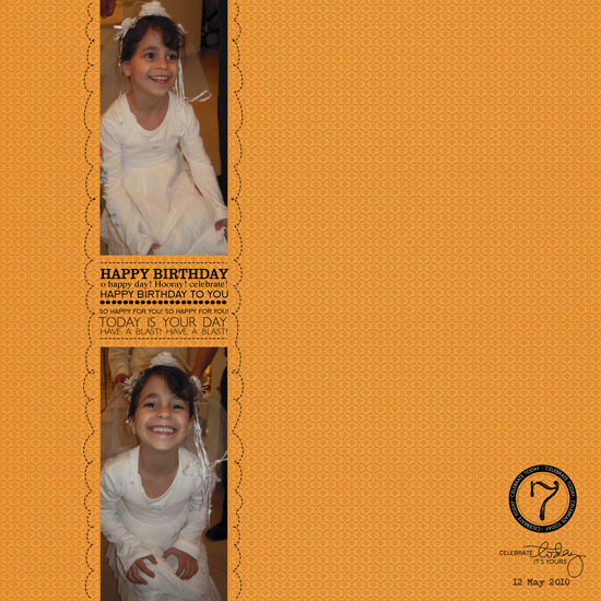
[Font: Adler; Digital Kits: KD Happy Day & KD Digi Essentials 5 (the number 7) – all by Karla Dudley.]

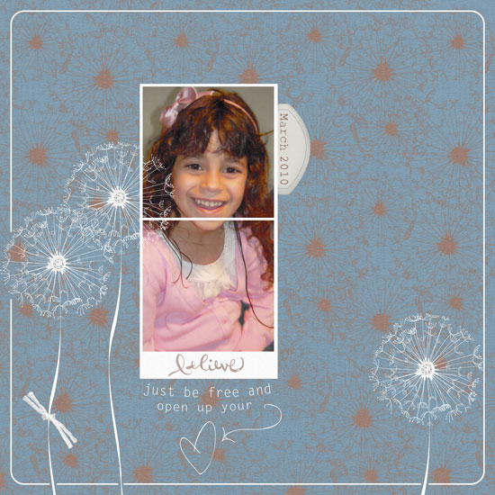
I may be prejudiced but I think my niece has the brightest, most beautiful smile I have ever seen.

I’d send some celebrities over for a red carpet seminar if I could. I really would.

Anyways…

This is the third birthday that I have missed and I am forever grateful that my sister takes the time to take the pictures as well as send them my way. I value these pictures so much, in fact, that I always immediately try to put together layouts with the stories behind the photos. As I only live vicariously through these photos, the stories I can tell aren’t so long and detail oriented. I mostly just try to capture the moment visually – as I imagine it had been.

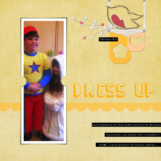
In this layout I used Karla Dudley’s new kit: KD Happy Day, almost exclusively (minus the digit ‘7’). On the right corner of my layout you may find a word-art image: “Celebrate today, it’s yours”. If you take a moment and look at the kit, you won’t find this image as it shows on my layout. Why? Because I had engaged myself in a minor digital surgery… Nipping the second part of the sentence and tucking it underneath.

Rearranging a digital image is basically the same as snipping a clear stamp off and repositioning its parts to conform to your design and needs (or inking up a different part of the stamp each time). Here is how to do that:

How To

  1. Open your image on Photoshop Elements. (If you are concerned about writing over your original image, use the ‘open as’ option.)
  2. Pick the rectangle selection tool and by clicking and dragging, choose the part you wish to sever. When you are done you will see the marching ants sign around the outline of the image. Make sure you haven’t accidentally picked any other part of the image. If you did – just choose it, while clicking the ALT/OPT key, to deselect.
  3. Make sure the layer of the image is selected – it will be highlighted if so.
  4. Pick the move tool and click and drag the part you have selected to its new place – it’s that easy. (You may also delete it altogether by clicking the DELETE key while it’s selected).
  5. Be careful not to get addicted and makeover your entire stash of digital images.

Share

Have you ever tried to alter your digital stash (or your traditional stash…)? Please, do share. Just leave a message and brag.

Make Your Own Planner Workshop
Check out Creativity Prompt’s self paced workshop: “Capture Your Dream”. In this workshop you will capture, follow and make your dream come true as well as document your journey in a fabulous mixed media mini album.

Think Outside the Box – Literally + Selective Coloring With Photoshop Elements

Thursday, May 6th, 2010

One way to get out of a creative rut is to use our stash – not as intended…

Use a “girly” collection for a boy’s layout or vice versa [as I did below].
Use a Christmas collection for a 4th of July layout.
Use a travel collection for a wedding.
Use patterned paper as a background and plain cardstock as an accent.
Use paper flowers as journaling blocks.
Use a winter themed paper for a summary layout.

Just ignore what the “box” says and create.
Free your mind.

In this layout I used Karla Dudley’s new kit KD Fly Girl for a manly layout of my husband shooting hoops at the beach:

i Heart you

[Fonts: Marketing Script, VTPortableRemington; Digital Kits: KD Fly Girl by Karla Dudley.]

And in this layout I used Karla’s KD Fly Boy kit to create a girlie-girl layout featuring my princess niece:

Believe

[Font: Rough Typewriter; Digital Kits: KD Fly Boy by Karla Dudley.]

Photoshop Elements Tip – Selective Coloring

On my “I heart You” layout I turned my photos to black and white (by de-saturating them) and kept just the vibrant yellow color of the ball.

The azure sky and turquoise ocean are beautiful, but they are distracting from the story I want to tell.

By removing the color of everything but the ball – I am drawing attention to it and hinting that the focus of my story is there.

There are 3 ways to get that look – choose the one most comfortable to you:

Method 1

  1. Duplicate the photo’s layer (press CTRL+J on a PC or CMD+J on a MAC).
  2. Make sure your upper layer is highlighted and de-saturate the colors all the way to the left (press CTRL+U on a PC or CMD+U on a MAC).
  3. Make sure your upper layer is highlighted and choose the eraser tool (work with the default circular brush). Lightly erase just the object whose color you’d like to retain.
  4. Merge both layers when you’re done.
  5. [P.S. This is also how I “colored” the heart red on the kit’s PNG file.]

Method 2

  1. Duplicate the photo’s layer (press CTRL+J on a PC or CMD+J on a MAC).
  2. Make sure your upper layer is highlighted and de-saturate the colors all the way to the left (press CTRL+U on a PC or CMD+U on a MAC).
  3. Make sure your upper layer is highlighted and choose the Quick Selection Tool. Click on the object whose color you wish to retain until it is highlighted completely by the marching ants. If you “slip” just unselect by pressing ALT on a PC or OPT on a MAC while simultaneously clicking on the part you don’t want selected.
  4. Press delete.
  5. Merge both layers together.

Method 3

  1. Choose the Quick Selection Tool. Click on the object whose color you wish to retain until it is highlighted completely by the marching ants. If you “slip” just unselect by pressing ALT on a PC or OPT on a MAC while simultaneously clicking on the part you don’t want selected and duplicate your selection (press CTRL+J on a PC or CMD+J on a MAC).
  2. Deselect (press CTRL+D on a PC or CMD+D on a MAC)
  3. Make sure your lower layer is highlighted and de-saturate the colors all the way to the left (press CTRL+U on a PC or CMD+U on a MAC).
  4. Merge both layers together.

Share

Are you using your stash in an untraditional way? Please share your ideas/ projects with us.

Be Playful – Creativity Prompt

Wednesday, April 21st, 2010

Dress Up - playful Layout

[Fonts: Rough_typewriter, Barnes_erc_; Digital Kits: KD Tweet, KD For The Boy, KD Frame Essentials – all by Karla Dudley.]

All work and no play? not in my (scrap)book!

Scrapbooking is important.
Telling the story is important.
Perpetuating memories is important.

saying that, scrapbooking is also a hobby.
As a hobby it’s supposed to be awesome.
As a hobby it’s supposed to be fun.
As a hobby it’s supposed to conform to OUR rules – not vice versa!

So I am very much into inserting some more playfulness into the process.

In this layout, with help from Karla Dudley‘s playful designs and a playful free font I have injected a much needed gaiety and cheerfulness into my layout.

The bird, for instance, is actually made out of 3 different images from the KD Tweet kit, that I layered and locked into one layer. You may need to adjust the angle of the image a bit (move your mouse cursor next to the top edge of the bounding box until it looks like a rounded arrow, then click and drag slightly up or down). I also “built” the bird-swing by using different images together, not necessarily the way one would traditionally use them.

You can mimic this idea/look with traditional “hard-copy” products by layering embellishments together or using things a bit differently than usual.

It made me smile. It might make you smile too!

Photoshop Elements Tip
How did I make the labeler-like strips?

Easy!

  • Use the rectangle shape tool to draw a short and wide strip. Make sure your shape color is black.
  • Choose the type tool and pick a typewriter font, make sure your font color is white.
  • Click on your rectangle and start typing. Click twice to commit.
  • Choose the move tool and pick 2 layers – the shape and the type (make sure they are both highlighted).
  • Click on the ‘align’ button at the top of your window and align the 2 layers together, both vertically and horizontally.
  • Lock the layers together to keep the alignment.
  • Repeat.

Share

How do you insert playfulness to your layouts? Share by leaving a comment (or a link to your playful layout)

Do You Know An Angel – Journaling Prompt + How To Make Personal Digital Word Art

Monday, April 5th, 2010

not All Angels Wear Wings

[Digital Kits: KD Cardstock Essentials, KD Blakely & KD Capture + Record – All by Karla Dudley]

Do you know an angel?

I know one.

My angel has a pure heart and beaming eyes.

My angel only knows one feeling. My angel knows LOVE.

My angel doesn’t envy. My angel isn’t mad. My angel doesn’t compete. My angel doesn’t hurt. My angel doesn’t lie. My angel doesn’t swear. He NEVER does. Ever.

My angel doesn’t wear wings, does yours do?

[In this layout is my nephew Shoham, 9 years old.]

Digital Tip

I created the word art in this layout my self. This is how I did it:

  1. First, I wrote my words on a white paper with various pens (both plain black pens and black calligraphy pens).
  2. Next, I scanned my paper in high resolution (600 dpi) and saved it as a JPG file.
  3. Then I opened the file with my Photoshop Elements and cranked up the levels [ctr+L/CMD+L]. Turning the “black” dial all the way to the first peak and the mid-tones dial all the way to the black one. The effect you are looking for is to have all the black parts REALLY black and all the white parts REALLY white.
  4. Then I turned my background layer into a simple layer, by clicking on it twice and opened a new layer beneath it.
  5. I made sure that I am on the original layer and picked up all the white parts with the Quick Selection Tool. I then pressed “delete” and the transparent layer showed up where the white used to be. I picked each of the small cavities inside the letters (e.g. the O’s and A’s) individually and deleted these white parts too.
  6. Then I merged the two layers together (merge not simplify!) and saved the file as a PNG file to keep the transparent attributes.
  7. Once your text is on a transparent background, you can select each word and each letter individually with the selection tool and then adjust its height and width with the move tool.

Give it a try, it is so simple and it lets you inject some personality to the digital layout. No tablet is necessary!

Share

Who is the angel in your life? share your thoughts by leaving a message.

Are you planning on giving the digital word art a try? If you do, please share your work with us.


Unleashing The Creative Child Within You