/** Font types */

Posts Tagged ‘Digital Kits’

My Little Princess Niece Is Seven

Tuesday, May 18th, 2010

Seven

[Fonts: Adler; Digital Kits: Count To Four (alpha and template) by Shimelle Laine, Color My World by Rhonna Farrer, KD Capture and Record by Karla Dudley.]

Shimelle has released a gorgeous new digital kit which includes a template, on which the layout is based on, and a set of pink alphas. So cute.

A template is just perfect when you have absolutely no time and you want to make a winning page. Just clip your photos in place, resize, perhaps recolor. Add your journaling, title and a couple elements to add a bit of yourself and voilà.

I really love this template because it looks like a layout I would have designed myself. The rectangles, the typewriter font, the accents. I love it. (I admit, if it was my layout it would probably align in a straight line – but that’s the beauty of working with templates. I try something new and fall in love with it).

Can you believe my niece is seven already??? She’s growing fast!

Share

Have you used a template or made a layout based on a sketch before? Please share by leaving a comment.

My Wedding Photo Book

Monday, May 10th, 2010

In less than a month, on June 4th to be exact, my husband and I will be celebrating our three year anniversary.

We got married in a Kibbutz in Israel, in a gorgeous garden in the woods and we also took some picture just before the ceremony at the village where Nadav’s parents are living – Addi.

I made a photo album just after the wedding, the day we got our photos from the photographer. I used a “custom made” program (the only one available at the time) where they offered pre-made templates and I just dragged the photos in and added the journaling.

When we moved to Dublin, Ireland – just a few months after our wedding, I left the photo book at my parents house. I didn’t want to ship it with all our belongings. Time have passed and in the meantime my parents got attached to the book and are treasuring it.

Just now, I finally took the time to make another photo album. This time I went for the “Digital Scrapbooking” option at Shutterfly, where you can design your own layouts with a photo editing software and control every single element that goes into your photo book. I love that idea.

I was working on my album for 20 hours in total (9 of which – sitting straight in front of the computer without getting up). Most of the time went for picking photos and writing all the journaling in reverse because Photoshop doesn’t handle Hebrew.

For a cohesive look I chose a color palette: Gray (#333333), Orange (#FF6600) & Kraft (from KD Capture and Record kit). I chose a bunch of digital kits that match the color palette and the idea behind the book (For instance, the stitching represents the connection between my husband and i). Clearly I went for Karla Dudley’s kits. I used: KD Digi Essentials, KD Digi Essentials 2, KD Jillian, KD Spring 10, KD Chesca, KD Blakely, KD Tweet, KD Capture and Record and KD Fly Girl.

If you want to take a peek at my finished book, you can do it here.

Have you used the Digital Scrapbooking option on Shutterfly? Have you used another service? Please share.

Think Outside the Box – Literally + Selective Coloring With Photoshop Elements

Thursday, May 6th, 2010

One way to get out of a creative rut is to use our stash – not as intended…

Use a “girly” collection for a boy’s layout or vice versa [as I did below].
Use a Christmas collection for a 4th of July layout.
Use a travel collection for a wedding.
Use patterned paper as a background and plain cardstock as an accent.
Use paper flowers as journaling blocks.
Use a winter themed paper for a summary layout.

Just ignore what the “box” says and create.
Free your mind.

In this layout I used Karla Dudley’s new kit KD Fly Girl for a manly layout of my husband shooting hoops at the beach:

i Heart you

[Fonts: Marketing Script, VTPortableRemington; Digital Kits: KD Fly Girl by Karla Dudley.]

And in this layout I used Karla’s KD Fly Boy kit to create a girlie-girl layout featuring my princess niece:

Believe

[Font: Rough Typewriter; Digital Kits: KD Fly Boy by Karla Dudley.]

Photoshop Elements Tip – Selective Coloring

On my “I heart You” layout I turned my photos to black and white (by de-saturating them) and kept just the vibrant yellow color of the ball.

The azure sky and turquoise ocean are beautiful, but they are distracting from the story I want to tell.

By removing the color of everything but the ball – I am drawing attention to it and hinting that the focus of my story is there.

There are 3 ways to get that look – choose the one most comfortable to you:

Method 1

  1. Duplicate the photo’s layer (press CTRL+J on a PC or CMD+J on a MAC).
  2. Make sure your upper layer is highlighted and de-saturate the colors all the way to the left (press CTRL+U on a PC or CMD+U on a MAC).
  3. Make sure your upper layer is highlighted and choose the eraser tool (work with the default circular brush). Lightly erase just the object whose color you’d like to retain.
  4. Merge both layers when you’re done.
  5. [P.S. This is also how I “colored” the heart red on the kit’s PNG file.]

Method 2

  1. Duplicate the photo’s layer (press CTRL+J on a PC or CMD+J on a MAC).
  2. Make sure your upper layer is highlighted and de-saturate the colors all the way to the left (press CTRL+U on a PC or CMD+U on a MAC).
  3. Make sure your upper layer is highlighted and choose the Quick Selection Tool. Click on the object whose color you wish to retain until it is highlighted completely by the marching ants. If you “slip” just unselect by pressing ALT on a PC or OPT on a MAC while simultaneously clicking on the part you don’t want selected.
  4. Press delete.
  5. Merge both layers together.

Method 3

  1. Choose the Quick Selection Tool. Click on the object whose color you wish to retain until it is highlighted completely by the marching ants. If you “slip” just unselect by pressing ALT on a PC or OPT on a MAC while simultaneously clicking on the part you don’t want selected and duplicate your selection (press CTRL+J on a PC or CMD+J on a MAC).
  2. Deselect (press CTRL+D on a PC or CMD+D on a MAC)
  3. Make sure your lower layer is highlighted and de-saturate the colors all the way to the left (press CTRL+U on a PC or CMD+U on a MAC).
  4. Merge both layers together.

Share

Are you using your stash in an untraditional way? Please share your ideas/ projects with us.

Picture Imperfect – Creativity Prompt

Monday, May 3rd, 2010

Me And My Little Quirks - Picture Imperfect

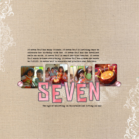
[Fonts: Urania_Czech; Digital Kits: KD Digi Essentials 5 (alpha brushes and coffee stains), KD Jillian (patterned papers) – all by Karla Dudley.]

In telling your story, the first thing you need to tackle is embracing imperfection.

Our true story, life story, isn’t about all the moments we were meticulously dressed, our make up perfectly applied and our hair glamorously done.
Our true story is about real – day to day – life.

It is the way we are when we wake up in the morning after a sleepless night.
It is the funny faces we allow ourselves to make only when we are surrounded with loved ones.
It is the way we deal with hardships.
It is the things we struggle with and eventually achieve.
It is the glow we have after completing a workout in the early hours of the day.
It is the laughter in our eyes when we make it to the top of the hill or when we meet a long lost friend.
It is about looking in the mirror and smiling because we accept ourselves the way we are.

This is who we truly are!

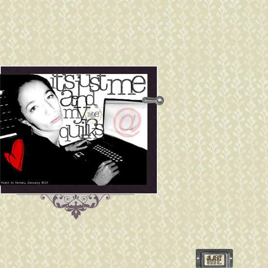
This picture was taken with Nadav’s cell phone camera.
I was jet lagged after a looooong flight and setting up my laptop at his parents’ guest room.
I was tired, cold, a bit dehydrated and making a goofy face (on purpose).
The picture is far from being perfect but it represents me. It portrays a side of me I want my future kids to see.

So I made a layout out of it.

Go ahead and embrace your imperfect pictures. Let them tell a true story.

Design Drill Down

As both me and the photo’s quality were sub par (hello understatement of the year…) I worked around it, making the photo look more “artistic” and “organic”.

I turned it to black and white, cranked up the levels settings, used funky alpha brushes instead of just a font and blurred and manipulated the background plus i added a touch of color to highlight my “true colors”…

The heart, lips and e-mail symbol make a visual triangle of red and the purple mat against the yellow background helps the photo pop up – as it is the main element.

The embellishment under the photo mat softens the quirky look and the bookplate “grounds” the page and also conveys the theme… Its small size is also purposeful story-wise.

There is also contrast between the soft and traditional look of the background pattern and the embellishment and the modern, funky look of the photo, myself and alphas.

Share

Have you scrapped an imperfect picture that tells a true story lately? share your thoughts with me and leave a comment.

National Scrapbooking Day Blog Hop

Saturday, May 1st, 2010

Biting the Bog Apple layout

[Fonts: Erika Ormig, Marketing Script; Digital Kits: KD Frame Essentials 1, KD Digi Essentials (masking tape), KD For The Boy (background paper), KD Fly Boy (paper airplane), KD Stamp Alphas 1 – all by Karla Dudley.]

Today is National Scrapbooking Day and to jump start the day some creative bloggers and I have gathered together in a special blog hop.

Each of us is sharing a layout with her interpretation to the subject – “Cross Country Road Trip”.

Go on and browse all the blogs to see their amazing layouts, to leave some loving and appreciative words behind and to participate in the drawings (On the table there are a copy of my e-book Unleashing The Creative Child Within You and My Mind’s Eye LUSH minibook with papers and who knows, you may hop and find some more goodies in your way)…

We invite you to join us and create a layout (all paper, all digital, or hybrid) about a trip to anywhere in the 50 United States [or anywhere else if you’ve never been to the States] and to submit a direct link to your wonderful layout on Rosann’s blog by May 15th at 11:59pm EST for a chance to win the goodies.

If you are new to my blog, make sure to pick up some of the FREE printables I am giving away each Friday. I’m sure you’d love yesterday’s woodgrain journaling labels!

Blog Hop Order

  1. Rosann => Submit your layout here for a chance to win!
  2. Jana
  3. Terri
  4. Kim
  5. Sharon
  6. Lacey
  7. Karen
  8. Avital => YOU ARE HERE

Enjoy!

Be Playful – Creativity Prompt

Wednesday, April 21st, 2010

Dress Up - playful Layout

[Fonts: Rough_typewriter, Barnes_erc_; Digital Kits: KD Tweet, KD For The Boy, KD Frame Essentials – all by Karla Dudley.]

All work and no play? not in my (scrap)book!

Scrapbooking is important.
Telling the story is important.
Perpetuating memories is important.

saying that, scrapbooking is also a hobby.
As a hobby it’s supposed to be awesome.
As a hobby it’s supposed to be fun.
As a hobby it’s supposed to conform to OUR rules – not vice versa!

So I am very much into inserting some more playfulness into the process.

In this layout, with help from Karla Dudley‘s playful designs and a playful free font I have injected a much needed gaiety and cheerfulness into my layout.

The bird, for instance, is actually made out of 3 different images from the KD Tweet kit, that I layered and locked into one layer. You may need to adjust the angle of the image a bit (move your mouse cursor next to the top edge of the bounding box until it looks like a rounded arrow, then click and drag slightly up or down). I also “built” the bird-swing by using different images together, not necessarily the way one would traditionally use them.

You can mimic this idea/look with traditional “hard-copy” products by layering embellishments together or using things a bit differently than usual.

It made me smile. It might make you smile too!

Photoshop Elements Tip
How did I make the labeler-like strips?

Easy!

  • Use the rectangle shape tool to draw a short and wide strip. Make sure your shape color is black.
  • Choose the type tool and pick a typewriter font, make sure your font color is white.
  • Click on your rectangle and start typing. Click twice to commit.
  • Choose the move tool and pick 2 layers – the shape and the type (make sure they are both highlighted).
  • Click on the ‘align’ button at the top of your window and align the 2 layers together, both vertically and horizontally.
  • Lock the layers together to keep the alignment.
  • Repeat.

Share

How do you insert playfulness to your layouts? Share by leaving a comment (or a link to your playful layout)

Siblings: Compare and contrast – Journaling Prompt

Tuesday, April 20th, 2010

Siblings

[Fonts: Asha, Tidy Hand; Digital Kits: Springtime Basics, Starburst Mini, Long and Winding Road, Can’t buy Me Love – All by Shimelle Laine at Two Peas In A Bucket.]

Journaling Reads

One is blond. One is brunette.
One is pale. One is tan.
One is quiet. One is verbose.
Both are fabulous.

Sometimes siblings are spitting images of each other.
Either they look alike, behave the same or think similarly – or all the above.
Sometimes the only thing siblings are sharing is their DNA.

Tsuf and Shoham, my niece and nephew are nothing alike.
[Except for both being very good kids]
They look very different and they behave really differently.

Try to make a short list and find what is similar and what is different between siblings in your family.

Share

Are you and your sibling look alike or do you look nothing like your sibling – or are you an only child?
How are your kids? Do they look and behave the same or do they have nothing in common?
Please share your comparisons. It’s fun!

New Release…

Thursday, April 15th, 2010

KD Tweet KD For The Boys KD Frame Essentials

I have been IMPATIENTLY waiting for the release of these three beauties, so I can share them with you. These gorgeous digi staples are the result of an ingenious creative strike by Karla Dudley that I am sure you’ll be able to enjoy as much as I do!

I love the mesh, doodled frames and paint splashes on KD For The Boy.
I love the tasteful doodles on KD Tweet.
I love the versatility of KD Frame Essentials.

LOVE them all!

So far, I have been playing with the KD For The Boys kit (the only thing stopping me from playing with them all is my serious lack of time):

Smile Forever Layout

[Fonts: BlackJack, Century, Century Gothic, Rough_typewriter; Digital Kits: KD For The Boys, KD Digi Essentials, KD Faded Sentiments, KD Spring ’10 – all by Karla Dudley.]
All Boy Layout

[Font: BlackJack; Digital Kits: KD For The Boys by Karla Dudley.]

Journaling Reads:

I love the youthful spirit Asaf & Ori have.
In their minds they can conquer the world.
In their minds they are strong enough.
In their minds they are smart enough.
In their minds they are capable of anything.
If they keep this state of mind, they may drive their parents crazy, but they will…

November 2008

Unleashing The Creative Child Within You

What Makes Anything Magical – Journaling Prompt

Wednesday, April 14th, 2010

Uvas Park Layout

[Fonts: Jesse James, Tidy Hand, rough_typewriter; Textures: Shadowhouse Creations; Digital Kits: KD Artist In Me (background paper), KD Blakely (patterned paper – floral), KD Sylvy (patterned paper – aqua), KD Trina (patterned paper – dark red), KD Digi Essentials (stitches + masking tape), KD Digi Essentials 2 (butterflies) – all kits by Karla Dudley.]

As a child I could look at my parents’ modest living room and see a palace. I looked at my red shoes and imagined how they transport me to Oz. I saw a smiling face in the sun and I swear I could see a caring bear resting on a cloud… Everything seemed magical when I was a child.

Sometimes I try to dig deep and find that ability to make the ordinary seem (and actually be) magical.

Journaling Prompt

What is it that makes the ordinary special and the plain magical? Write it down.

My journaling reads:

How can a natural preserve become magical?
Easy.
Add a couple friends you like hanging out with.
A husband you’re in love with and the perfect springy weather.
Done.

I also added character to my photo, by applying texture digitally. As you can see below, the changes are very subtle but add to the general ambiance:

Preview - original and textured

Digital Tip – How To Add Magic With Texture Using Photoshop Elements

To add texture to your photo, all you need to do is to add layers and play with the blending modes.

  • Download the high definition texture files (or take pictures of textured materials yourself). In this photo I used a few texture files by Shadowhouse Creations.
  • Open the texture photos and with the selection tool picked, drag them over to your original photo (make sure you save it under a different name). The textured file should appear as a layer above your original picture’s layer.
  • Resize the texture file so it covers your photo, by dragging the bounding box to place.
  • The texture should now cover your entire document.
  • Next, go to the blending modes drop menu. It is placed right above your layers view, left to the opacity levels and is ‘Normal’ by default.
    Play with the mode. Start with ‘Overlay’ or ‘Soft Light’ modes. See what happens…
  • Play with the opacity.
  • Add a solid color layer by clicking on the ‘adjustment level’ button and choosing ‘solid color’. Lower the opacity and see what happens.
  • Explore and have fun!

Are you feeling the magic yet?

Share

How are you transforming the plain into magical? Share your thoughts by leaving a message.
Have you tried the texture technique? How did it work for you? Please let me know 🙂

Unleashing The Creative Child Within You

The Unexpected Things That Bring Bliss – Journaling Prompt

Tuesday, April 13th, 2010

Total Bliss

[Fonts: KD Everyday, Modern No. 20, Gulim, Erika Ormig; Digital Kits: KD Sylvy, KD Say It With Love, KD fancy Borders 1 – all by Karla Dudley.]

Raindrops on roses and whiskers on kittens
Bright copper kettles and warm woolen mittens
Brown paper packages tied up with strings
These are a few of my favorite things
From: The Sound Of Music

Clearly, winning the lottery or receiving the Nobel Prize creates unimaginable bliss, but as the song says – also are the little, unexpected things in life.

Let me share something with you. It’s a very personal fact pertaining to my taste in men…

For a LONG time I fell in love with smart men. When I say ‘smart’ I clearly mean genius, well above average. The higher the IQ, the deeper my infatuation.
As I met Nadav (my husband) during my first year in Law School I am talking about teen love…

I loved the intellectual challenge. I loved the puns and the riddles. I loved all the mind games. I loved the extra reading to stay on top… (Have I mentioned how competitive I were in high-school?)
I loved it all. The more mind twirling I had to exercise – the more I enjoyed the chats with my latest crush.

Then I met Nadav…

Don’t get me wrong here. Nadav is one of them geniuses everyone loves to hate (but can’t).
He finished everything he ever did “Summa Cum Laude”, astonishing all his professors.

But he doesn’t take it too seriously. He enjoys life and he makes life enjoyable to anyone near him.

When I met him I suddenly didn’t feel like playing mind games.
I felt comfortable enough to be weak sometimes.
I felt comfortable enough to let my guard down around him.

I realized that I like that better and that for the first time I am truly in LOVE.

Journaling Reads:

I can always expect you to find bliss in everyday things.
You manage to find beauty and Joy everywhere you look.
Every occasion is a reason for a celebration.
Every menial task can become magical after you are done with it.
Everyday and everything is blissful in your mind and I am lucky to live this life with you.

You may think it’s the big things that stir you and brings happiness into your life, but it is the small, unexpected gestures that transforms your life from plain to extraordinary.

So take a pen and a journal and list all the things that makes you go ahhhhhhhhh.

BE HAPPY!

Share

What brings total bliss to your life? Share by leaving a comment, I’m looking forward to hearing from you guys.

Unleashing The Creative Child Within You
Back when we were kids creativity came naturally to us. Everything was possible and our prolific imagination was the only limit we knew.
Through the years we have grown apart from our inner creative child and along with that – have lost our pristine and utter joy of creation.

In this e-book I will pave your way back to your inner creative child, brick by brick.

“Unleashing The Creative Child Within You” will explain why you became distant from your core creativity and will reveal the secret to getting it back.
With exercises designed specifically to help you find the inner child within you, regain its confidence and unleash it – you are bound to get your mojo back faster than you think.

Your inner creative child wants to come out and play, so don’t disappoint it and get “Unleashing The Creative Child Within You“.